Wednesday, March 13, 2013

Lesson 5 Black & White with Partial Color Effect

I found these amazing photos online - and I thought you'd like to know how to partially colorize a photo.


 So, here we go.

1. Open a full color photo
2. On the right side of your screen is the layers menu.  Locate and click on the icon that looks like a half dark/half light circle

3. From the dropdown menu select gradient map

4. A menu box will appear. a) If if the "Gradient Used for Grayscale Mapping" is not black and white, click the triangle next to the colored rectangle and select Black and white. b) Click OK.  c) This will give you a crisp black and white image.

5. Click the Gradient May layer

6. Next, locate and click the Brush Tool (on the left vertical menu)

7. Change the foreground color to black.  
  • If you don't remember how to do this look back at Week 4's lesson.  Please note: When using the Gradient Map Adjustment layer you will stick with the colors, black, white and gray.  a) Black will erase part of your gradient may layer, b) white will cover it up - perfect for fixing mistakes), and c) Gray will let some of the background image show through.


8. Zoom in on part of your picture.  
  • You will zoom in and out A LOT during this lesson.

9. Adjust your brush size and hardness (you should be in normal mode).  
  • You will also need to adjust your brush size - sometimes you will use 1 or 2 pixels - throughout this project.


10. Start to draw in black on the Gradient Map Layer (NOT on the background layer)
11. Save your work in your folder.

Remember, these toolbars and instructions are specific for Photoshop Elements 4.0.  If you are using a different version of Photoshop Elements you may have to search around a bit to find the right icons or menus. 


Wednesday, March 6, 2013

Week 4 - More Layers (This time with TEXT)

Today we are going start from scratch!

If you're using Adobe Photoshop Elements 4.0 select "Start from Scratch" at the opening splash screen. (It is the last choice on the top menu.)

This will take you to a new document and you get to specify the name, the height, width and the pixels.

1) Call it your name
2) width 7 inches
3) height 5 inches
4) 150 pixels/inch
5) Click ok

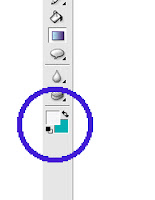
Now let's play around with the background color.  Using the icon in the bottom left of your screen that looks like two squares overlapping each other, select the background color (the one on the bottom) and pick your favorite color.


Next, click the gradient icon.  The gradient icon is also shown in the picture to the right.  It is the fourth icon above the foreground/background color icon, just under the paint can.  When you click on this icon a new toolbar appears at the top of Photoshop Elements.  From the right side (the part right beneath the words right side) choose a style of gradient.
Then click your mouse in the top left corner of your page, hold your mouse and move it horizontally to the bottom right corner.  Release your mouse.  Do you like how it looks? If no, play around some more.  If yes, let's move on to the next step.

We're playing with text layers today.  Click on the Text Icon:


Click on the background and look to your right, a new layer appears.  When you start typing the layer becomes fixed.  Type as much as you like - your whole name, a sentence...  For this project we are going to type ONE LETTER.  The first letter of your name.  And then we're going to add another layer and type the second letter of your name.  Keep repeating this step until you have all of the letters of your name.

Here is my project showing my daughter's name:  What do you think?


Kinda boring right.  The text is all in a line, just as though I typed it in Word.

Here's a shot of the magic:


See all of those layers on the right side?  Those can all be moved independently and altered as much as you like.

Check this out:


Now you do it.  Go to the layer with the first letter of your name in it.  Highlight the letter and change the font size to 300.  Change the font face.  Change the color.  Move it around.

Repeat this step until all of the letters are nice and big and whatever colors you like.  Here's mine:


In class we'll talk about rotating the letters slightly and changing the way they over lap.  (See how the R is on top of the A and the K? All you have to do is move the layer of the R above the layer of K.)

Now, I pretty much hate the background I picked, so I'm going to change it and add a shape.


I can't wait to see what you create!