Wednesday, March 13, 2013

Lesson 5 Black & White with Partial Color Effect

I found these amazing photos online - and I thought you'd like to know how to partially colorize a photo.


 So, here we go.

1. Open a full color photo
2. On the right side of your screen is the layers menu.  Locate and click on the icon that looks like a half dark/half light circle

3. From the dropdown menu select gradient map

4. A 
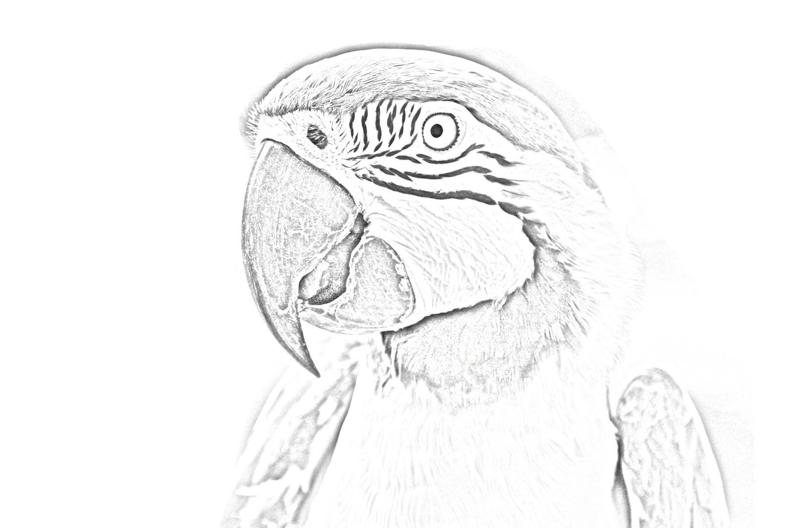
menu box will appear. a) If if the "Gradient Used for Grayscale Mapping" is not black and white, click the triangle next to the colored rectangle and select Black and white. b) Click OK.  c) This will give you a crisp black and white image.

5. Click the Gradient May layer

6. Next, locate and click the Brush Tool (on the left vertical menu)

7. Change the foreground color to black.  
  • If you don't remember how to do this look back at Week 4's lesson.  Please note: When using the Gradient Map Adjustment layer you will stick with the colors, black, white and gray.  a) Black will erase part of your gradient may layer, b) white will cover it up - perfect for fixing mistakes), and c) Gray will let some of the background image show through.


8. Zoom in on part of your picture.  
  • You will zoom in and out A LOT during this lesson.

9. Adjust your brush size and hardness (you should be in normal mode).  
  • You will also need to adjust your brush size - sometimes you will use 1 or 2 pixels - throughout this project.


10. Start to draw in black on the Gradient Map Layer (NOT on the background layer)
11. Save your work in your folder.

Remember, these toolbars and instructions are specific for Photoshop Elements 4.0.  If you are using a different version of Photoshop Elements you may have to search around a bit to find the right icons or menus. 


Wednesday, March 6, 2013

Week 4 - More Layers (This time with TEXT)

Today we are going start from scratch!

If you're using Adobe Photoshop Elements 4.0 select "Start from Scratch" at the opening splash screen. (It is the last choice on the top menu.)

This will take you to a new document and you get to specify the name, the height, width and the pixels.

1) Call it your name
2) width 7 inches
3) height 5 inches
4) 150 pixels/inch
5) Click ok

Now let's play around with the background color.  Using the icon in the bottom left of your screen that looks like two squares overlapping each other, select the background color (the one on the bottom) and pick your favorite color.


Next, click the gradient icon.  The gradient icon is also shown in the picture to the right.  It is the fourth icon above the foreground/background color icon, just under the paint can.  When you click on this icon a new toolbar appears at the top of Photoshop Elements.  From the right side (the part right beneath the words right side) choose a style of gradient.
Then click your mouse in the top left corner of your page, hold your mouse and move it horizontally to the bottom right corner.  Release your mouse.  Do you like how it looks? If no, play around some more.  If yes, let's move on to the next step.

We're playing with text layers today.  Click on the Text Icon:


Click on the background and look to your right, a new layer appears.  When you start typing the layer becomes fixed.  Type as much as you like - your whole name, a sentence...  For this project we are going to type ONE LETTER.  The first letter of your name.  And then we're going to add another layer and type the second letter of your name.  Keep repeating this step until you have all of the letters of your name.

Here is my project showing my daughter's name:  What do you think?


Kinda boring right.  The text is all in a line, just as though I typed it in Word.

Here's a shot of the magic:


See all of those layers on the right side?  Those can all be moved independently and altered as much as you like.

Check this out:


Now you do it.  Go to the layer with the first letter of your name in it.  Highlight the letter and change the font size to 300.  Change the font face.  Change the color.  Move it around.

Repeat this step until all of the letters are nice and big and whatever colors you like.  Here's mine:


In class we'll talk about rotating the letters slightly and changing the way they over lap.  (See how the R is on top of the A and the K? All you have to do is move the layer of the R above the layer of K.)

Now, I pretty much hate the background I picked, so I'm going to change it and add a shape.


I can't wait to see what you create!

Wednesday, February 27, 2013

Week 3 - Cartoon drawings (more fun with layers)

If you go to Palm Crest Elementary, or if you've taken my class in summer school, you have probably made a cartoon drawing of yourself using Photoshop Elements.  If you have, this will be good practice.  If not, I think you'll really enjoy this fun way to learn about layers.

  1. So let's start by opening a photo in Photoshop Elements.
  2. The next thing we do is make a NEW layer.  Name it OUTLINE and click ok
  3. Next, select the paint brush.
  4. Select color black, a hard edge brush style & a size (20 is good)
  5. Draw over image, outline everything in detail
  6. Add a new layer.  Name it COLORS and click ok
  7. Drag the COLORS layer and drop it below the OUTLINE layer
  8. Deselect (click) the eye on the Background layer to make the eye disappear
  9. While on the COLOR layer, use the paintbrush to paint your image.  Color the lightest parts of the image first.  
  10. Use the mouse wheel to change the size and color of the brush as needed.  Zoom in & out on your image to make sure you get the fine detail.
  11. Use the eraser button/icon or undo arrow if you go outside the lines.
  12. SAVE your work in your folder:  When you are done for the day, save your document with the extension .psd (this is the default).  When you are totally done making changes to your image save it as a .jpg (select from the dropdown menu) 


Many Thanks to Mrs. Bentz for writing up the steps.

Here is the start screen of Photoshop Elements 4.0.  This is what your toolbars and layers should look like when you first begin.


Tuesday, February 26, 2013

Week 2 in Review (aka - the Not-So-Great GATE Experience)

Last week was tough!  How frustrating that the program was so different from what I use to prep for class (I use version 9, the GATE lab has version 4)!  How tough to have more confusion than solutions!  And I don't like how grumpy I feel when "disasters" strike.   In addition to all of that, I scheduled my blog post to go live at 4:30 pm last Wednesday, and guess what?  It didn't.  AND I forgot to check my work, so I didn't know until today, 6 days later.  Not a good thing - I am sorry!

Thank YOU so much for your patience in class.  You were terrific, amazing and kind!  I'm bringing treats this week to show my appreciation.

I have learned that not-so-great days are often the days when I learn the most.  So here is my list of great things learned from last week's not-so-great GATE class:

  • Photoshop is a little tricky (I relearned this one)
  • Try again
  • Explore different options
  • Try something else
  • The undo button has a limit to how far back it can go
  • Refer to the the instructions over and over again
  • Programs change so it helps to know the lingo: layers, Gaussian, invert...
  • Double check: there is a difference between duplicate layers and create new layer!
  • I learned a little bit more about Adobe(tm).  I had heard that Adobe is known for is completely revamping their Photoshop software-almost as though they are starting from scratch-every time they upgrade.  I didn't think the difference would be too dramatic on the Elements end, but boy, was I wrong.
  • GATE kids are pretty terrific (I relearned this one too)
What did you learn?  Leave a comment and let me know.

Wednesday, February 20, 2013

Week Two

Exploring Layers

This week we took a normal color photo and turned it into the type of photo you would see in a coloring book.

original photo thanks to funtimebirdy.wordpress.com


Here are the steps:

1) Duplicate the background layer (layer, duplicate layer) name your new layer: Parrot 1.  We now have two layers.  Click on the new layer to select it.

2) Next we need to take all of the color out of the photo.  This is referred to as "desaturating."

With the layer "Parrot 1" selected choose Filter > Adjustments > Gradient Map and choose the black and white option.  If your version of Photoshop Elements doesn't have this option, use Image > Adjustments > Desaturate

3) We need to duplicate the layer Parrot 1.  Right click on Parrot 1 in the Layers tray and choose duplicate layer.  When prompted, name your new layer: Parrot 2.  You should now have three layers.  Click on your new layer (Parrot 2).

4) With Parrot 2 selected go to Filter > Adjustments > Invert.  This will make your photo look like a negative.  Pretty cool!  But there's more work to be done.

5) In the Layers tray (on the right of your workspace) change the Layers blend mode for Parrot 2 from "Normal" to "Color Dodge."  This will make your photo almost completely white, but don't worry!

6) Still working on the layer Parrot 2 go to Filter > Blur > Gaussian Blur.  When the dialog box appears start moving the Radius Slider to a level where a sketch of your image begins to appear.  (On the left side there is no image, on the right is the entire image - you'll want something in between).

For my parrot sketch I worked in Photoshop Elements 9.0 and used a Radius setting of 11.5 pixels.

Sometimes our images don't work out the way we want them to work.  When that happens I play around with other settings.  With this project try the Motion Blur Filter as well as the Radial Blur Filter.  Exploring is one way we improve our knowledge.  And remember - SAVE YOUR WORK!

I want to thank Jennifer Apple for teaching me this technique.  I learned from this website.

Leave me a comment with questions or suggestions.  I'd love to see your creation - especially if you try something at home.

Thursday, February 14, 2013

Week One


Here's an overview of what we learned in class today:

What's the difference? .png, .jpg, .tif, .gif,   Click on over here for details.  For our class - the biggest difference is how we can use the file.  Since we will be working in Adobe Photoshop Elements our work will usually have the extension .psd (photoshop document).  A photoshop document or .psd can only be used in that program.  To make it "portable" we need to save it as an interchangeable file for example: .jpg or .png.  For our purposes, we'll stick with .jpg.

TIP: if your file won't open in another program, it might not be the right format. 

What are layers? You'll hear me talk a lot about layers in class today.  Layers are part of what makes Photoshop Elements magical.  Imagine you want to go outside in the freezing cold.  Your mom says, "bundle up!"  Bundle up to a mom means: wear lots of layers.  Put a shirt on over your undershirt.  Put a sweater on over your shirt, add a jacket on top of your sweater.  Add a scarf, wear mittens and a hat.  You get it right?  It's cold!  Let's say your shirt is something very exciting with no sleeves, yellow stripes and maybe a little T-Rex or two.  The sweater you put on top of it is going to be a solid color with a UCLA logo and long sleeves.  When you add that sweater on top of your shirt no one knows that you're wearing yellow stripes underneath.  And when you put that coat on no one can tell you've got that sweater on underneath...We just see what's on top.  So why wear a yellow striped shirt at all?  The answer, in this case, is that it keeps you warm.  It also shows us about your personality.

In Photoshop a layer can work the same way: we only see what's on top.  So, if something is showing that you don't want to show, move it down a layer or two.  Now, let's imagine that your coat is made of clear plastic.  Your friends can see your sweater now and they know you're a big UCLA fan.  What if your sweater had patches of clear plastic so your friends could also see that awesome, yellow T-Rex shirt?  That'd be cool.  And that's more the way layers work in Photoshop.  Layers are all transparent until you add something too them.  You can cover up or uncover any part of the image you're working on.  Plus, you can move stuff around.  No more typing in a line - everything can get up and move.  Where do you want those mittens?  On your head?  Feet?  You name it.  if it is on a layer, it can be manipulated.

So keep these things in mind:
1) the whole point of layers is to protect the original image (the coat protects the original YOU)
2) layers can be moved up or down to reveal or hide different things
3) if you want to move something (words, an image, a single letter) put it on a separate layer.  (We don't usually put our boots and socks on at the exact same time...that'd be quite a trick!)

The best way to learn about layers is to start using them.  So let's play!

One last thought:  BACK UP YOUR WORK - SAVE, SAVE, SAVE!!

Tuesday, February 12, 2013

Welcome to Phun with Photoshop Elements

It's so great to have you here for La Canada Unified's GATE Spring 2013

Our syllabus will follow this schedule:


13 February
  • review file types
  • importance of saving
  • what are layers
20 February
  • using layers to make a coloring book image out of a photo
  • making a comic of yourself
27 February 
  • continue making a comic of yourself
  • creating a black and white photo from a color photo
  • how to make one color pop on a black and white photo
6 March
  • playing with text (layers, layers and more layers)
13 March
  • Putting it all together - making a graphic card
20 March
  • Last class: Questions, finishing up projects

What you will need:  

  • Permission to view and comment on my blog
  • If you want to use your own photos for this class, please send them to me at queen_kristen@att.net.  Leave a comment on the blog so I know to check for your images.  If you don't have a digital version of your image, I am happy to create one, but will need at least one full week to prep.